Now that my final design has been produced and everythings finished I'm quite proud of what I created. I think I've come a long way as at the beginning of the project I really didn't feel like I had any direction or any clue of how to get moving. I think I really got to grips with this project when we did the repeat shape workshop as this was when I felt I was able to begin to experiment with my idea and take it forward with Richards guidance. Overall I've quite enjoyed working with paper even though at the beginning I was in two minds about it. But I've found it fun and creative and even though I knew there was paper artists out there, it's been eye opening to see more of what's been done.
Also, I enjoyed using a blog to show my development. Even though I've used blogs before, I've never used them to show my uni work, and I found it easy to use.
Monday 14 March 2011
Wednesday 9 March 2011
Final Designs...
I chose two of the photos I'd made for a final piece, and in photoshop added some text.
Here are the final outcomes:
1)


Here are the final outcomes:
1)

2)

However, although I liked the look of these posters and got positive feedback from others, I still wasn't sure it was giving the right impression I wanted the viewers to see. The photos I think are interesting, but didn't show off the "100" as well as I'd hoped. I then took to looking through my photos once again to see if there were any better photographs I could use. I then decided on one of the simplest photos I took as although it was simple, it gave off the right message, but still in it's own way looked interesting. The font I used was the same as above, which is also simple to keep with GF Smiths design.
Final Poster:

I believe the final outcome worked very well, it's clear and simple but beautifully portrayed. It's not too overflowed, and the message is clear. Just what I wanted.
Also gives a 3D effect that the '100' looks like it's sticking out of the page.
Subject Matter...
Based on Peter Callesen's work, I was thinking maybe a staged photograph with type and image? Although that's not really what GF Smith's products are about... So I decided, using the same shape that I repeated in my previous outcome, if I formed it properly, I could make the "100" from it. Maybe the photos could have some depth...
I tried to photograph the piece I made afterward, to get it so that it had depth.. However I don't really think this worked very well.


Type Posters - Layout.
Looking at existing posters on design websites, and advertising sites such as Ads of the World, I looked at some different layouts for type that I could develop on.


I also focused my search on exhibition posters, as that's what the design is going to be for.

Although this poster is in the theme of Gilbert and George, I think the type gets hidden by the backgrounds bold colours.

This poster doesnt really have much to it, but in my case as the subject matter is paper and GFSmith is has a bold, clean theme, I think I'd also like to keep my design clean and effective without too much clutter.

I think this design is still a bit too busy, but something along the lines of.
100 Years of GF Smith Paper
Create a poster to celebrate 100 years of GF Smith Paper, exploring paper in all it's forms.
Must-haves:
- A2
- Portrait
- Must have "100 Years of GF Smith Paper, Design Museum, 01-31 July 2011" written on.
So what's GF Smith paper?
GF Smith paper is a trade specialising in paper merchant, for over 100... So the brief is made up? Disappointing as I'd quite like to see a paper exhibition! Especially as I love what I've researched during this project. Oh well... On with the research.
What I got from looking at GFSmith.com was that their printed product are very simplistic but effective with a bold typeface that is usually the main subject matter. Not often is photos used. However, even if my design is just the type, it'd need to be made out of paper and therefore photographed... However I will incorporate the bold text alongside the photo.


Monday 7 March 2011


It's a lot bigger than I expected...
I set out to get larger thicker paper, and ended up with two A2 sheets of it. This resulted in a lot of tracing round my prototype piece, and a lot of cutting out and scoring down the middles of each segment.


So many shapes...

Now to fit them together...

Even though my sculpture is finished, I still may need to add extra strength to hold it together as I don't think pritt stick is going to hold very long...
Prototyping..
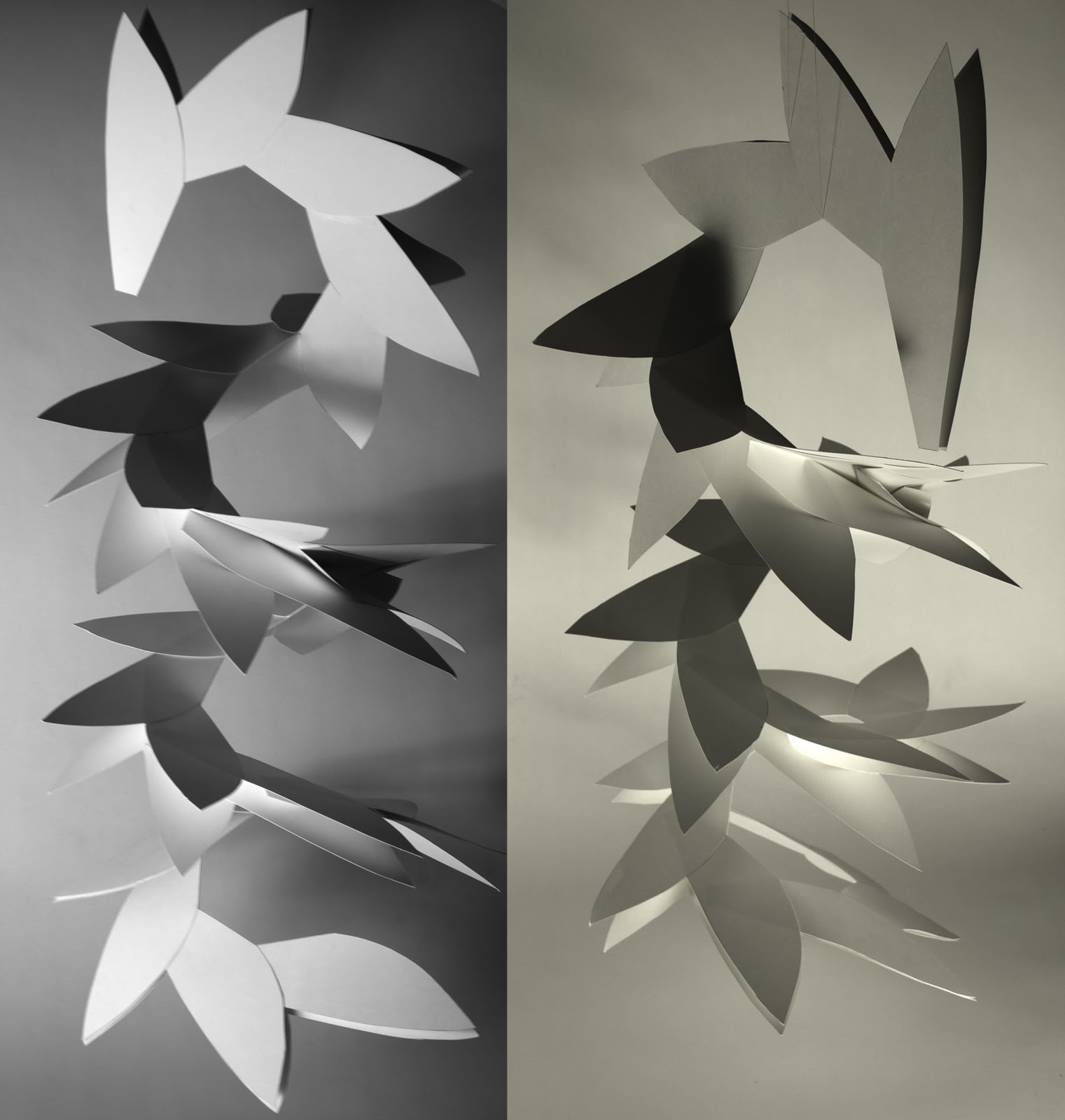
Mocking up a small version for ways to stick it together using slots, I took photos that came out with quite a patterned (sunflower?) effect:


However the slot idea wasn't strong enough to just hold my piece together, I'd have to stick it too. So I decided, using A3 paper, to mocked up a bigger scale of my final design. This also told me the paper wasn't strong enough. So I went with it anyway, and finished a mock up of what my final outcome could be like, and here's what I ended with:

Doing this mock up helped me work out the finer kinks in my sculpture, such as do I stick the ends inside, or outside, how far in does it go? how bent do I make it? Will it be strong enough?
Subscribe to:
Posts (Atom)